IRCTC, redesigned four ways.
Three real IRCTC pages, train search, hotels and air, captured live and rebuilt by three AI design skills, Anthropic's official frontend-design skill, Impeccable and Taste, plus a hybrid that merges the last two. Same content, same data, four points of view, run twice. Round 2 turns the skills loose to push the front-end frontier; Round 1 keeps them on the original layouts as a control. The frontier output is the stronger work, so it comes first.
How the skills performed
An honest read of how each skill's methodology fared on a fundamentally transactional government portal. Winners below are per dimension, judged on the brief: a booking tool that has to be trusted and used, not just admired.
| Page | Hierarchy | Typography | Color | Restraint | Layout |
|---|---|---|---|---|---|
| Train search | Impeccable | Frontend Design | Hybrid | Impeccable | Frontend Design |
| Hotels | Impeccable | Taste | Hybrid | Impeccable | Taste |
| Air | Impeccable | Frontend Design | Hybrid | Impeccable | Hybrid |
The same skills, told to push the frontier.
Reimagined from first principles, with the booking task and real data kept intact. 2D motion-max: GSAP scroll-telling, Motion micro-interactions, Lenis smooth-scroll, drawing route lines, parallax photography. Every effect honors reduced-motion and degrades to a clean static page. Best experienced by actually scrolling.
Frontend Design · Frontier
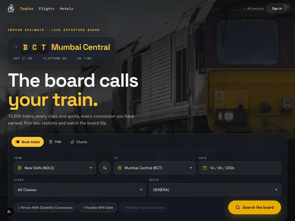
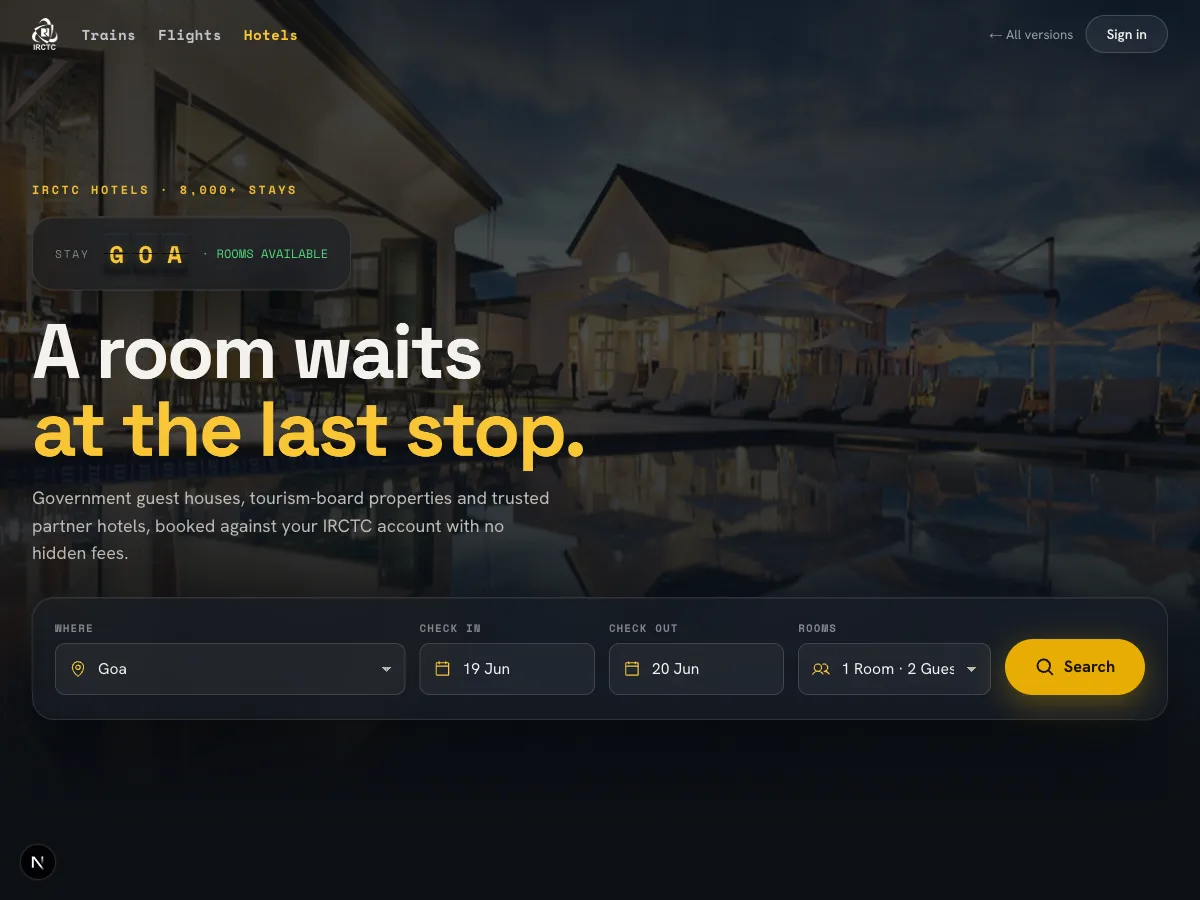
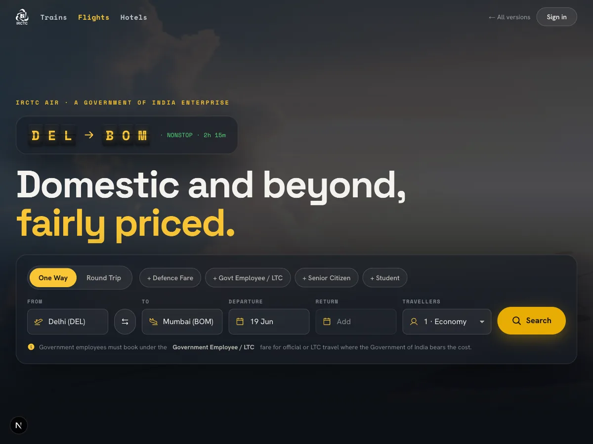
Anthropic's official frontend-design skill, dials maxed. The night platform: a glowing split-flap board flips your destination into place, huge station signage, parallax platform photography, signal-colour status. The signature is the board itself, and it still never blocks the booking.
Impeccable · Frontier
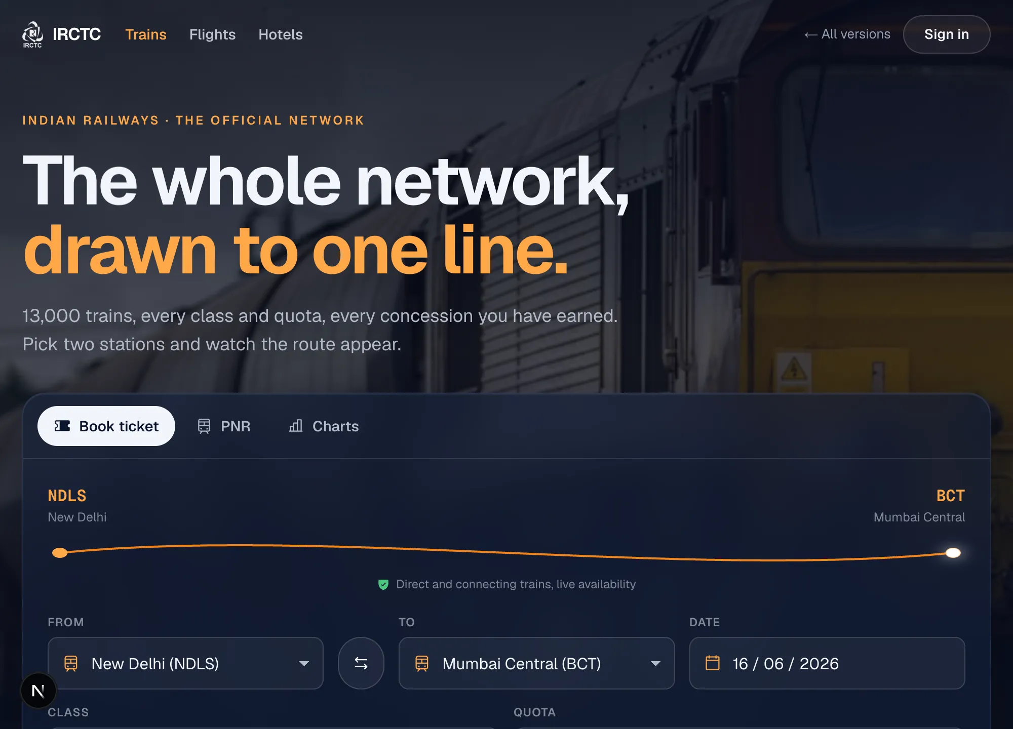
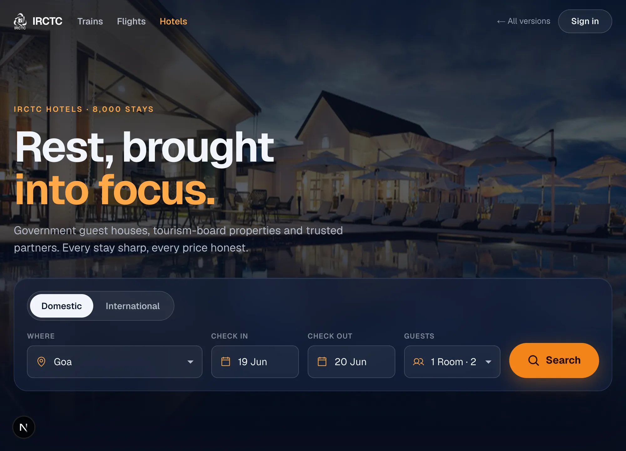
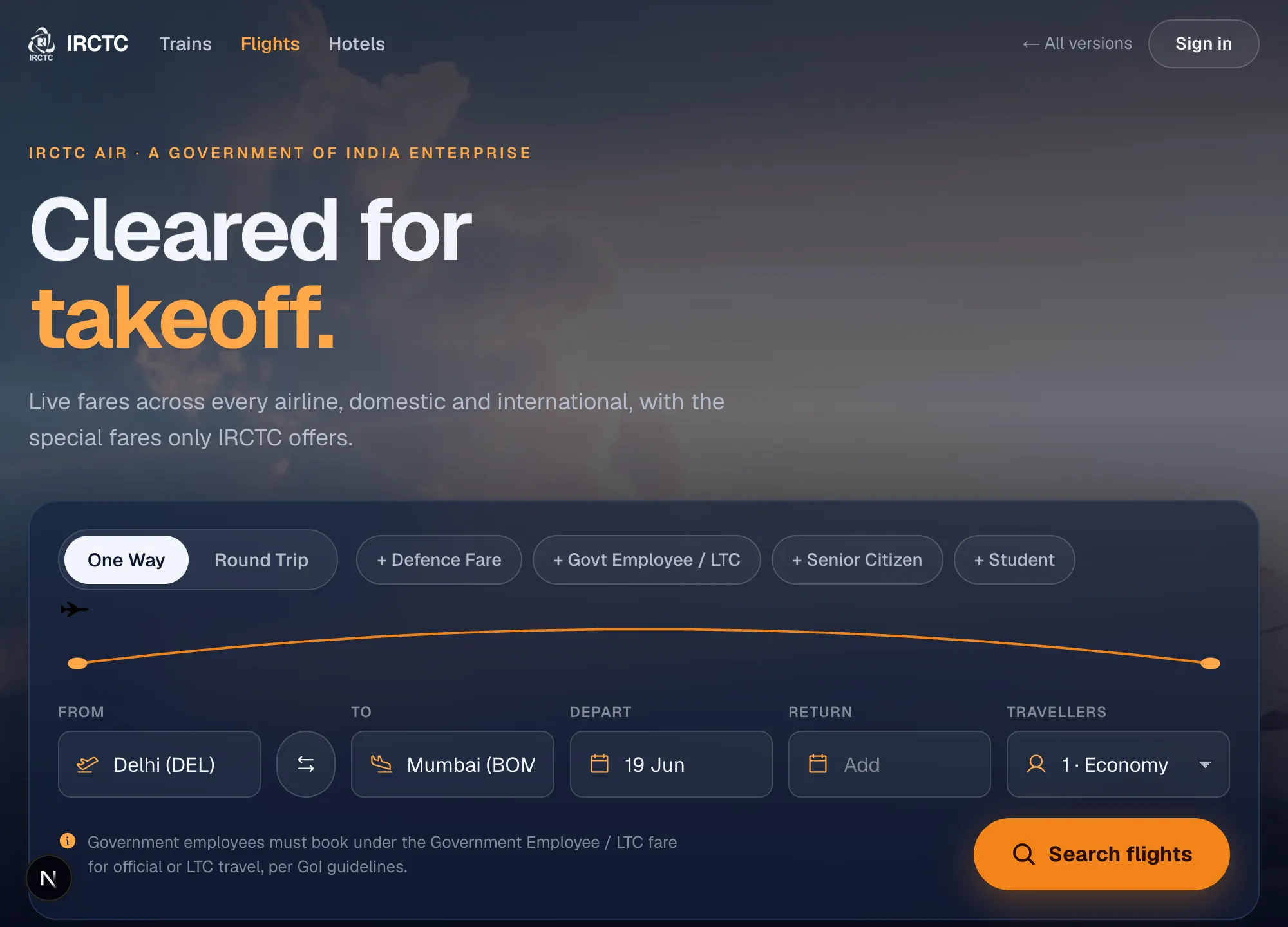
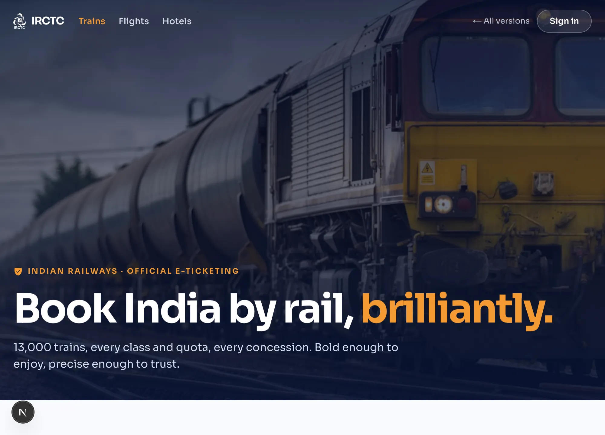
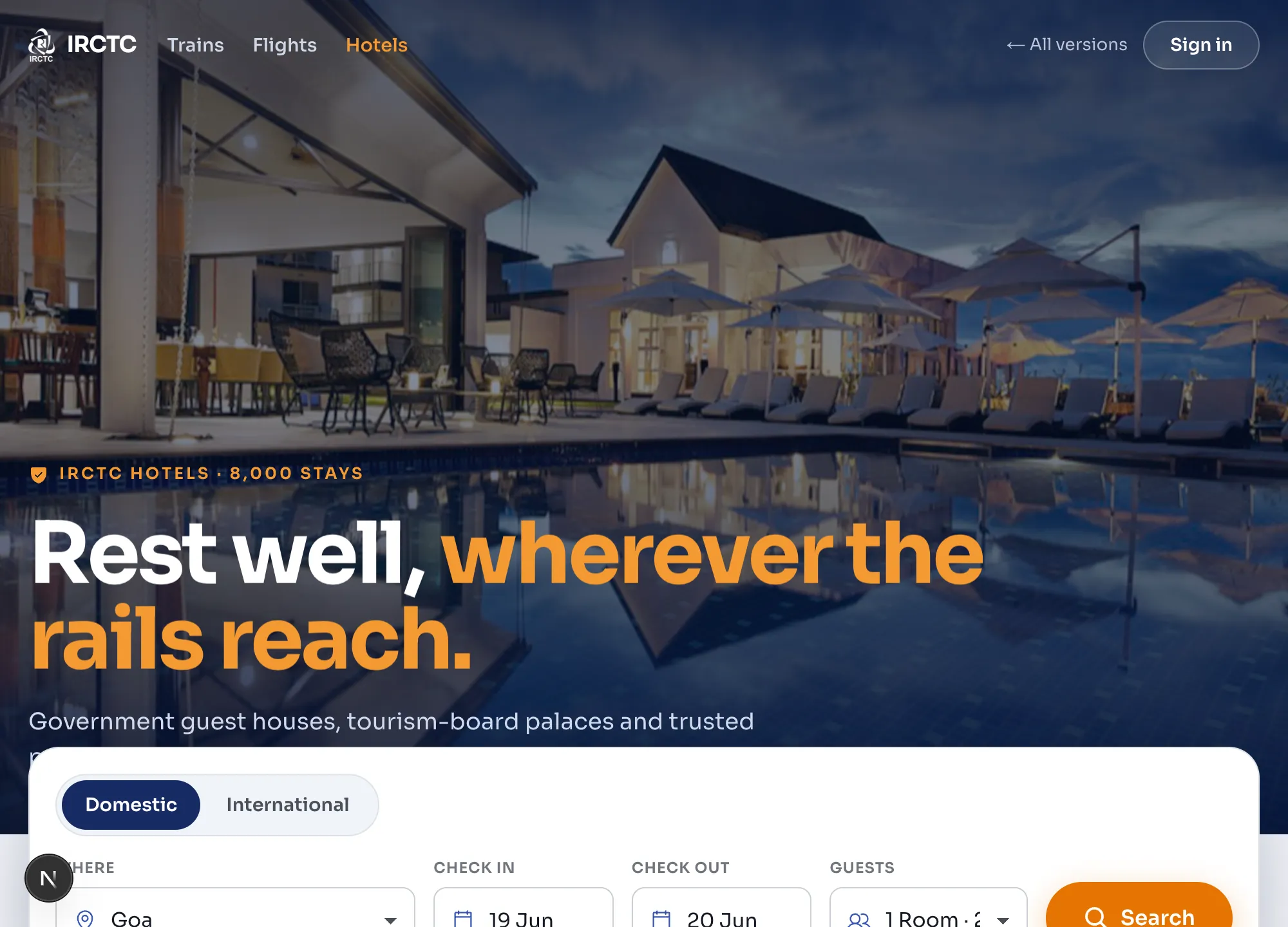
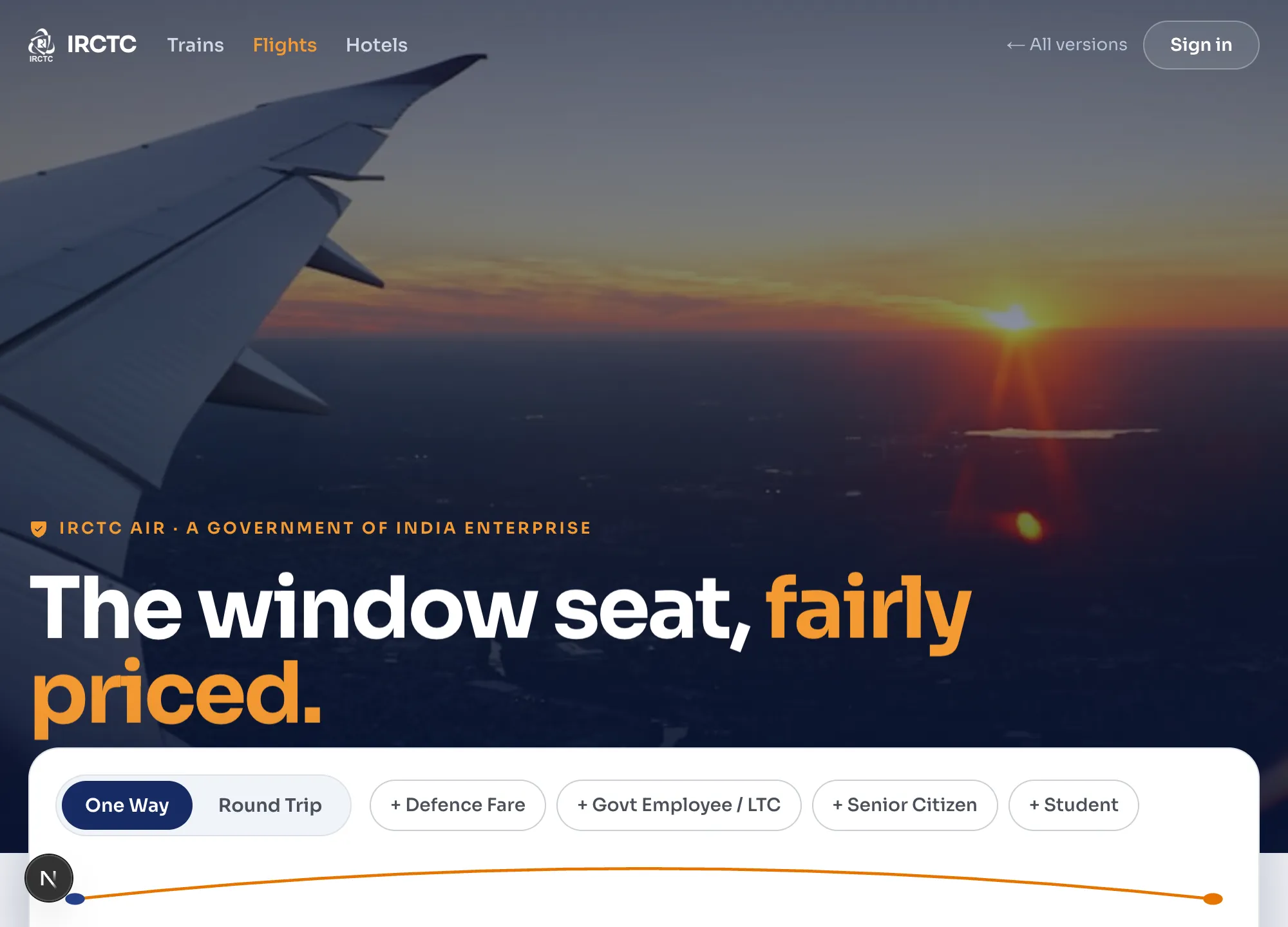
Dark precision instrument. Cinematic parallax photo heroes, a route line that draws between your two stations, magnetic spring controls, count-up stats. Extraordinary in how it feels, never in the way.
Taste · Frontier
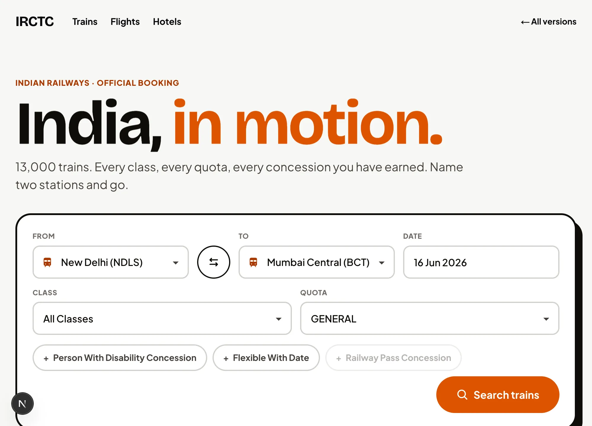
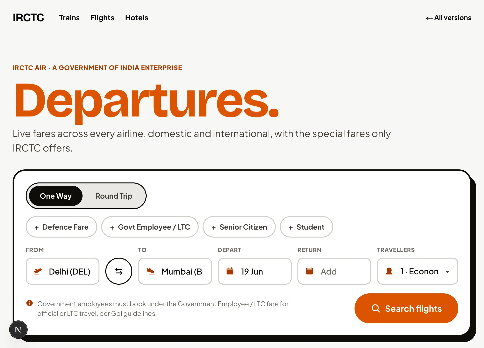
Awwwards editorial, dials maxed. Mega kinetic Bricolage type, a horizontal scroll-hijack journey through India, sticky-stack stays, big count-up fares. Bold, expressive, unmistakable.

Hybrid · Frontier
An immersive branded journey that resolves into a precise instrument. Indigo and saffron, Sora, photographic parallax heroes, the drawing route line, then a calm tabular body. Cinema up top, craft below.
Frontend Design, unleashed
Plays a card neither other skill does: it builds the whole design from the railway’s own artifacts. The split-flap board that flips your destination into place is the most thematically on-the-nose signature of the set, and one of the most legible. Bold and specific, and still a usable board even at full tilt.
Impeccable, unleashed
Its overdrive discipline holds: one extraordinary moment per page (the drawing route line), spring physics on controls, premium dark materials. It goes bold without ever stopping being a usable instrument. The most restrained “crazy” of the three, and arguably the most shippable.
Taste, unleashed
This is its home turf. Maxed dials, mega kinetic type, a horizontal scroll-hijack journey, sticky-stack panels. The most spectacular and memorable of the three. The booking task survives, but here the experience leads and the form follows.
Hybrid, unleashed
Zones the drama: an immersive cinematic hero up top, a calm precise instrument the moment you need to act. It keeps Taste’s wow and Impeccable’s trust in one scroll. The best answer to going crazy while still having to book a train.
The same skills, playing it straight.
Each skill applied to the real IRCTC pages with the original layouts respected, so the skill's judgement is the only variable. No custom motion stack, no reimagining: just the skill, the brief, and the booking task. The control group, and a fair test of what a skill does on its own out of the box.
Frontend Design
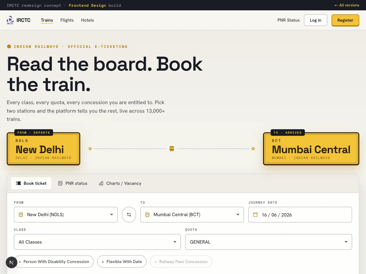
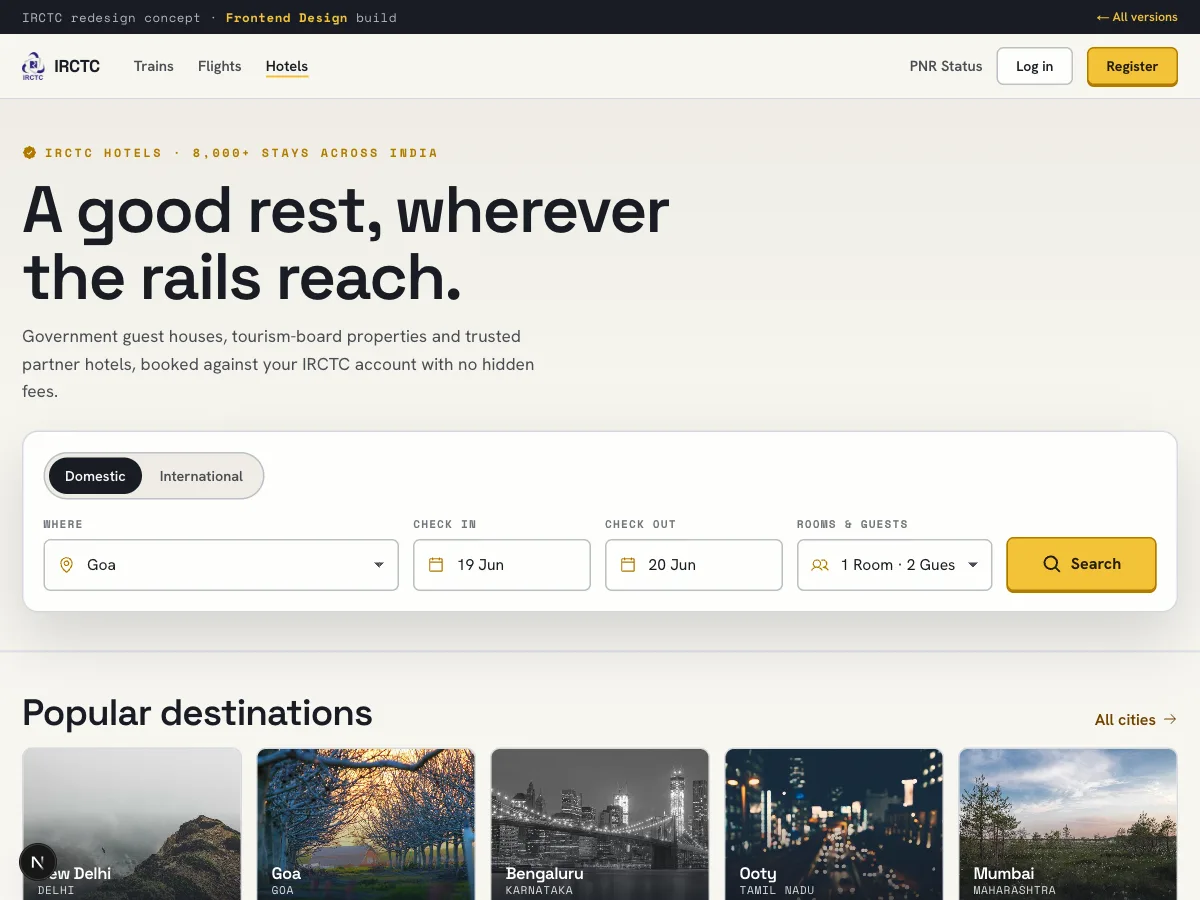
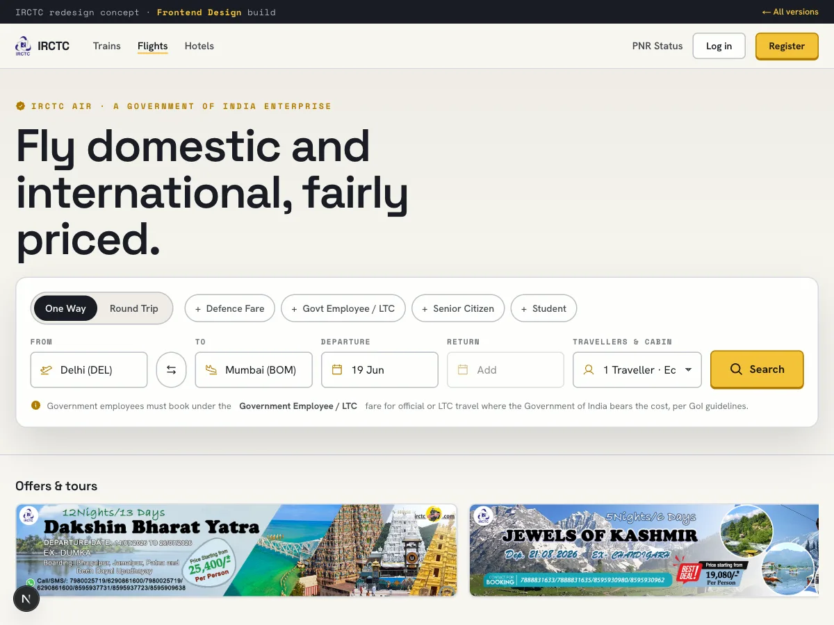
Grounded in the platformTypeface · Space GroteskAnthropic's official frontend-design skill. Its instinct is to mine the subject's own world, so IRCTC becomes the railway platform: a yellow station name board as the hero, a dark split-flap departure board for live trains, the signal triad (green/amber/red) for status. Space Grotesk, Hanken Grotesk and Space Mono. Unmistakably Indian Railways, calm everywhere but the board.
Impeccable
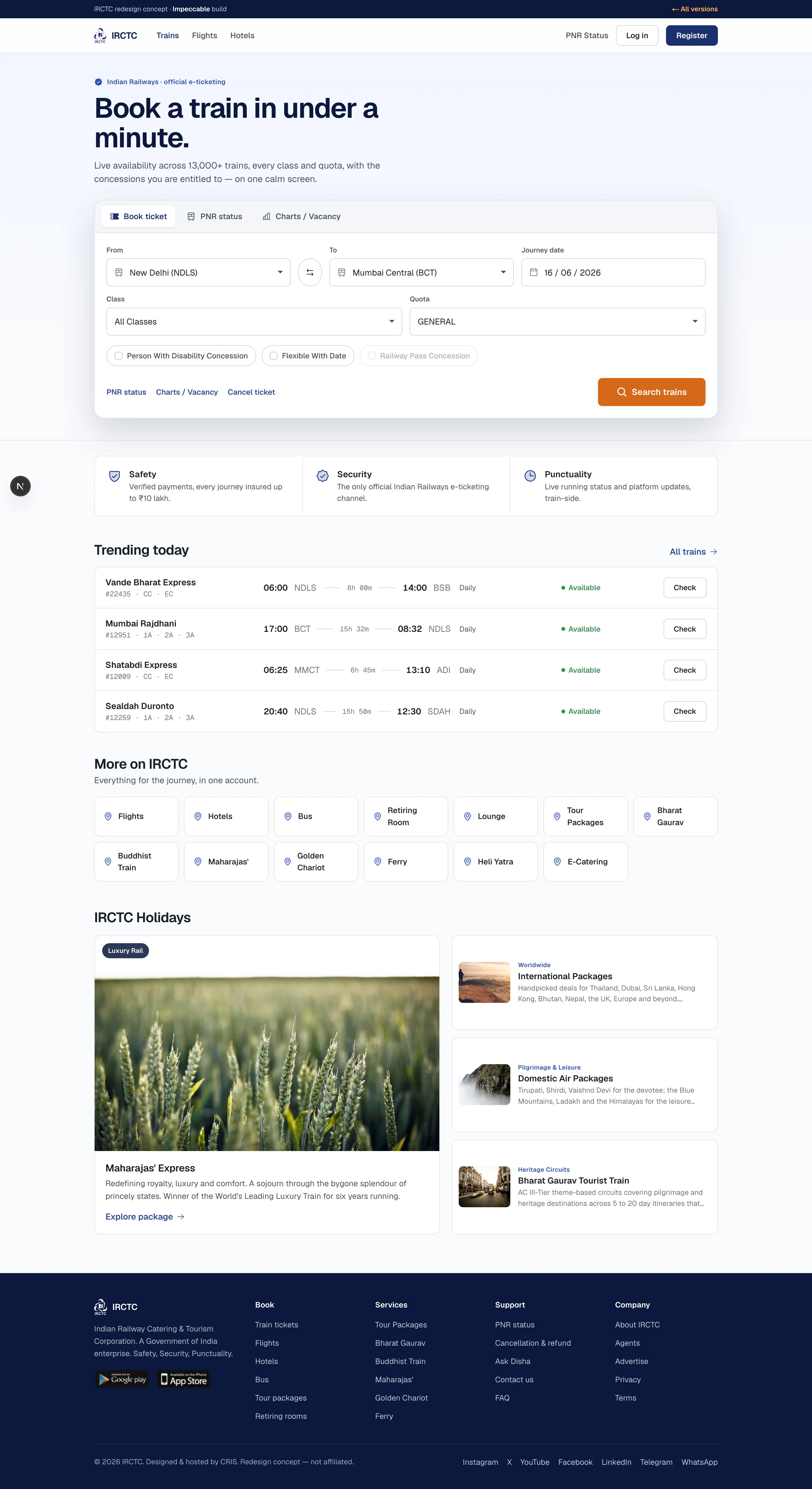
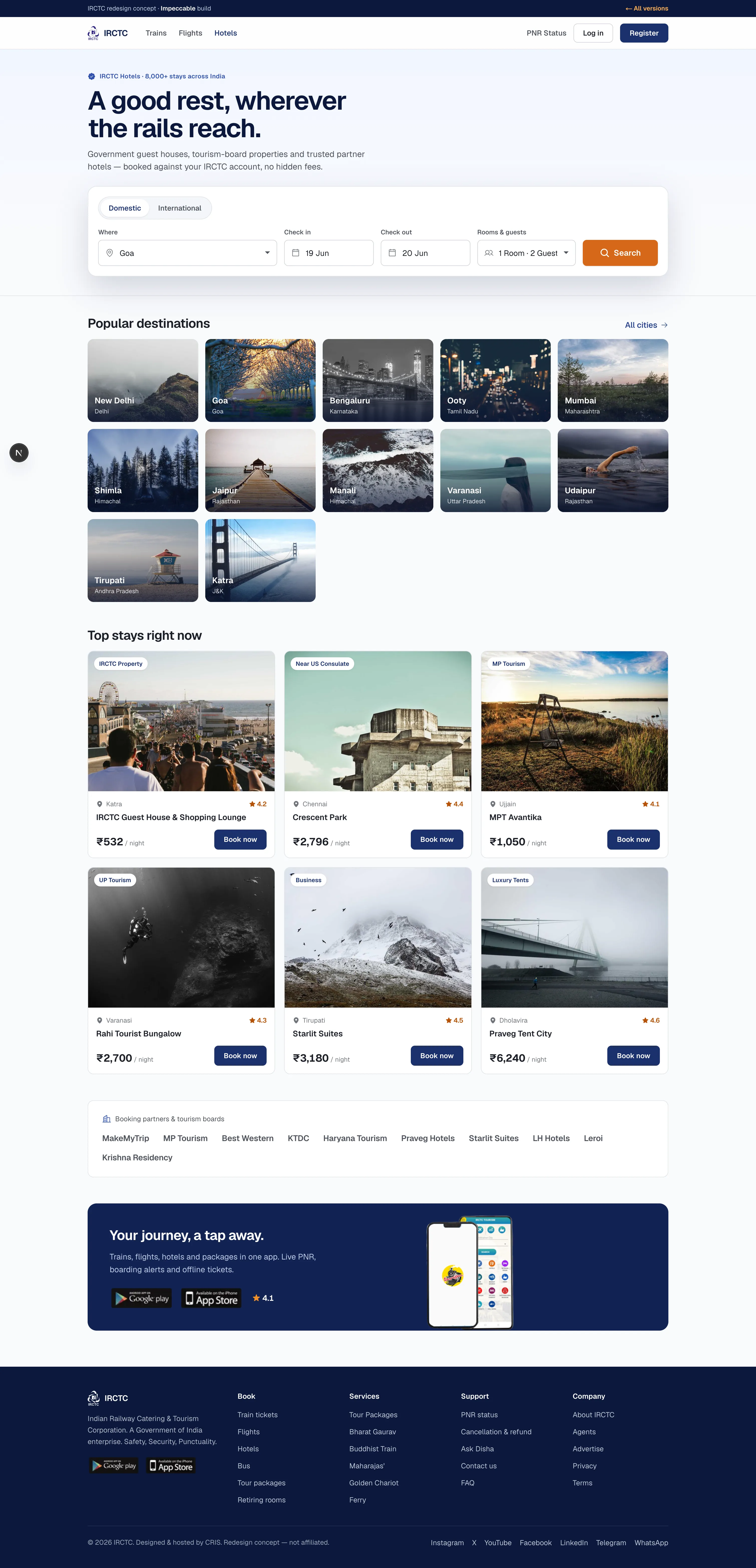
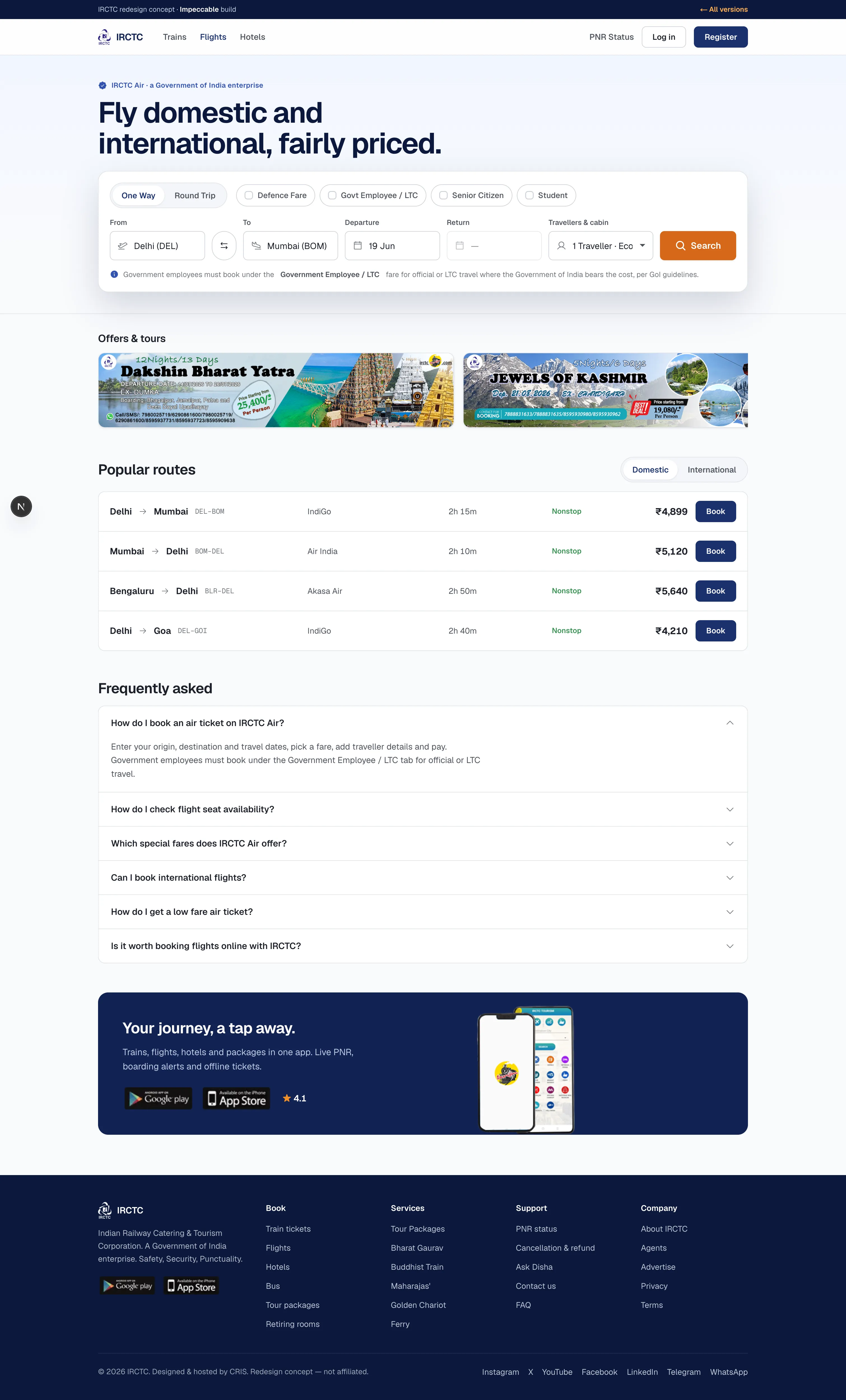
Craft by commitmentTypeface · GeistReads IRCTC as a product, so design serves the task. Committed OKLCH brand indigo with a single saffron accent, Geist with tabular figures, airtight form states, quick functional motion. The bar is earned familiarity: what if Stripe built Indian Railways.
Taste
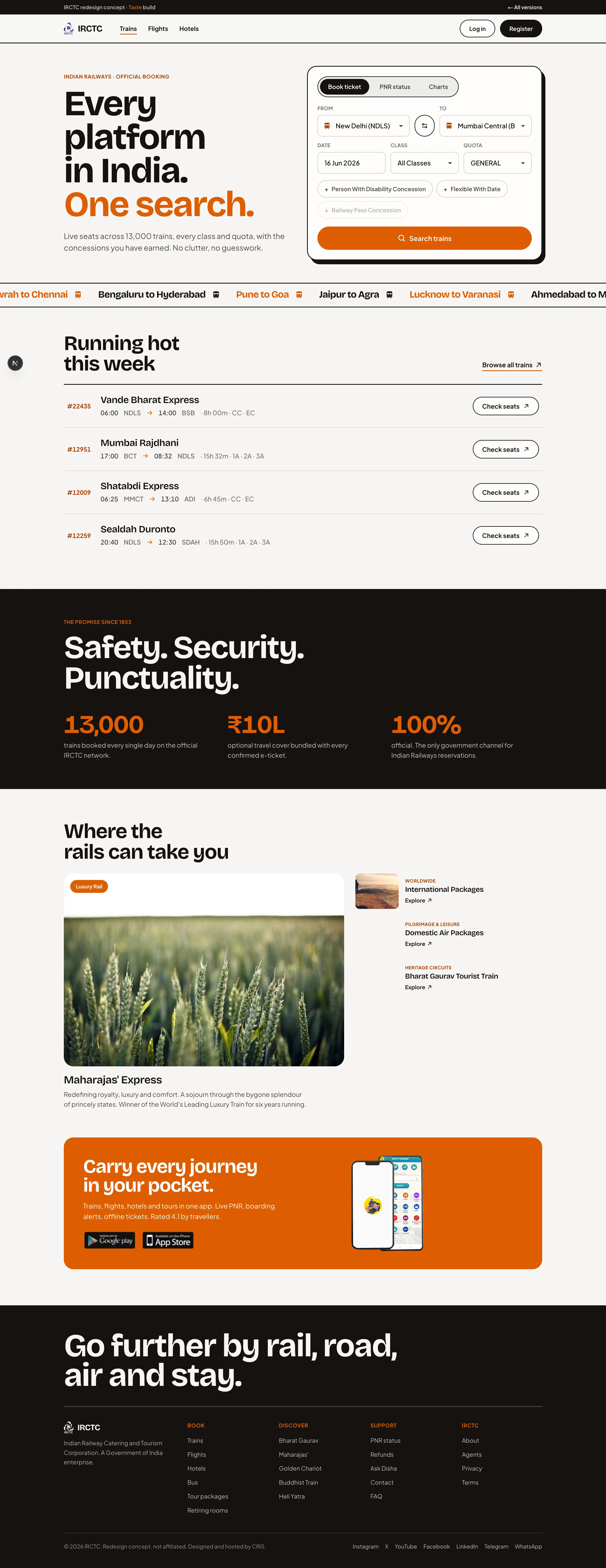
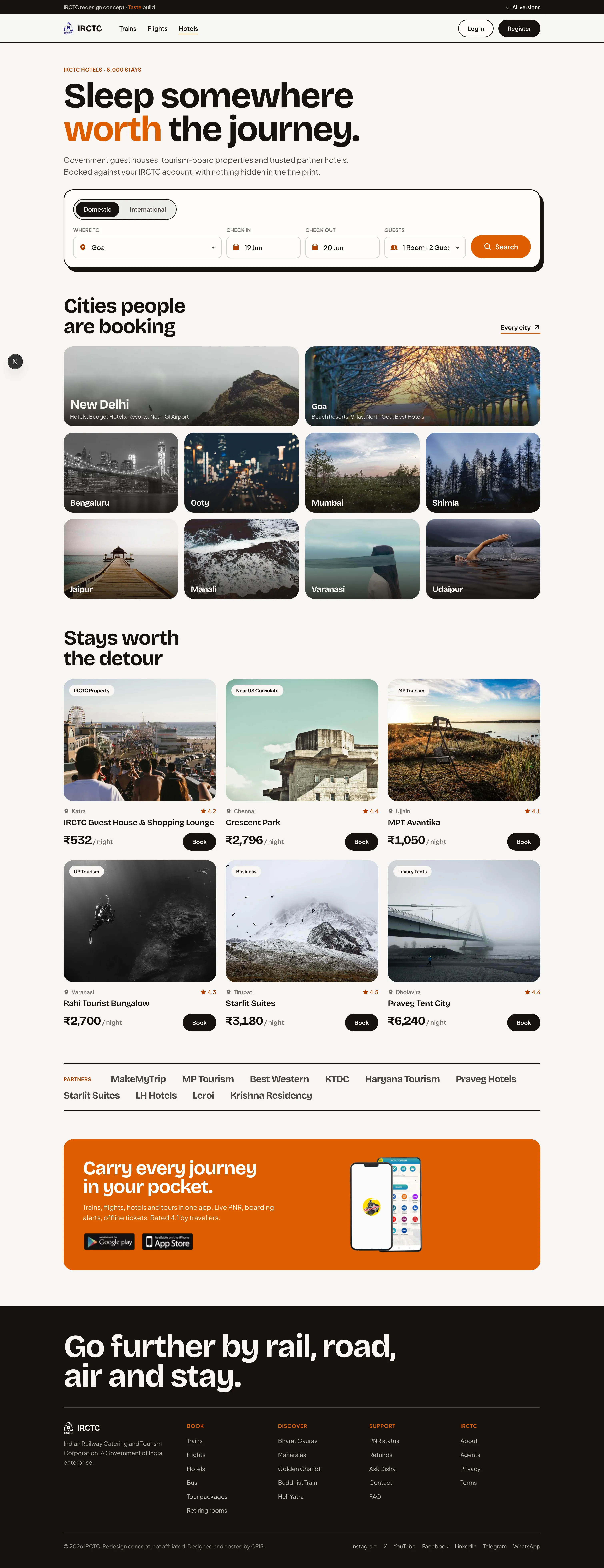
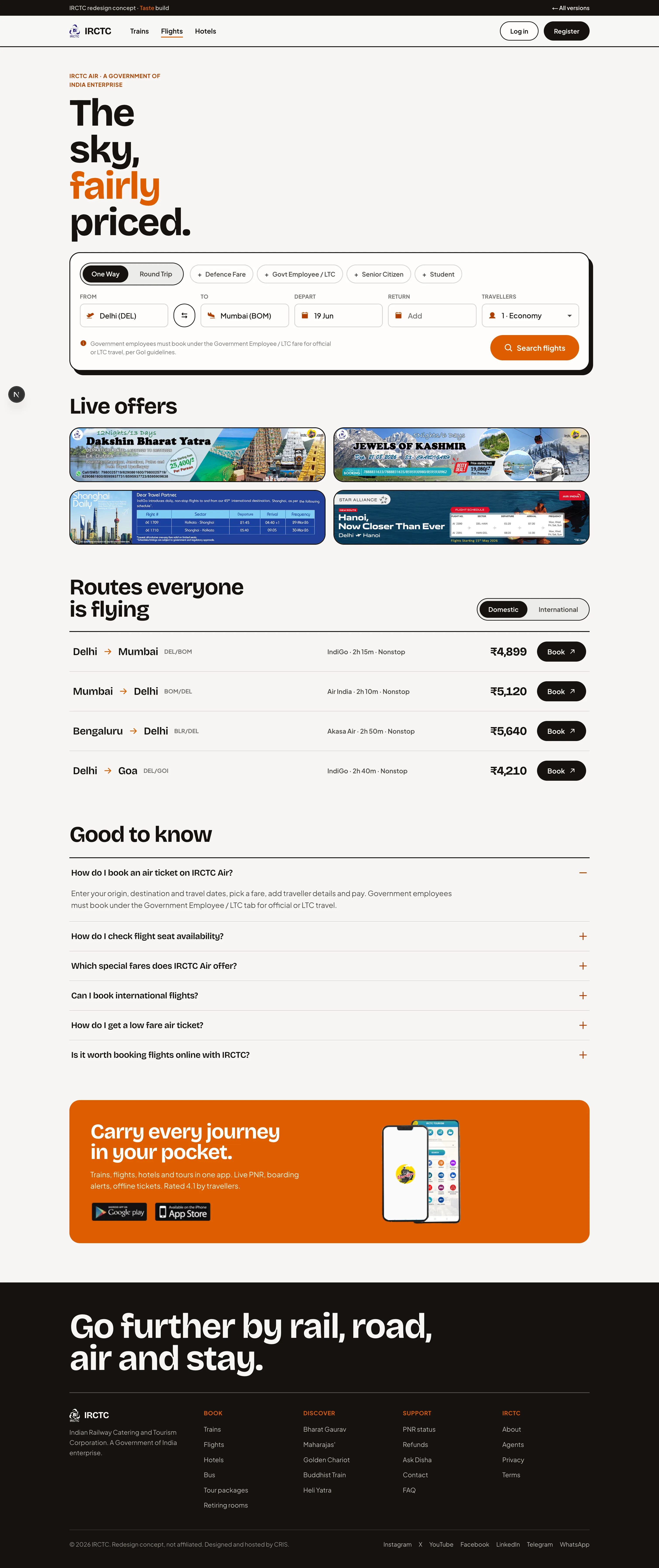
Anti-slop by prohibitionTypeface · Bricolage GrotesqueReads IRCTC as a redesign for everyday travellers. Off-white and ink with one locked saffron accent, Bricolage Grotesque display, asymmetric editorial layout, a route marquee and one dark color-block band. Dials 7/5/4. Zero em-dashes, eyebrow restraint, real images.
Hybrid
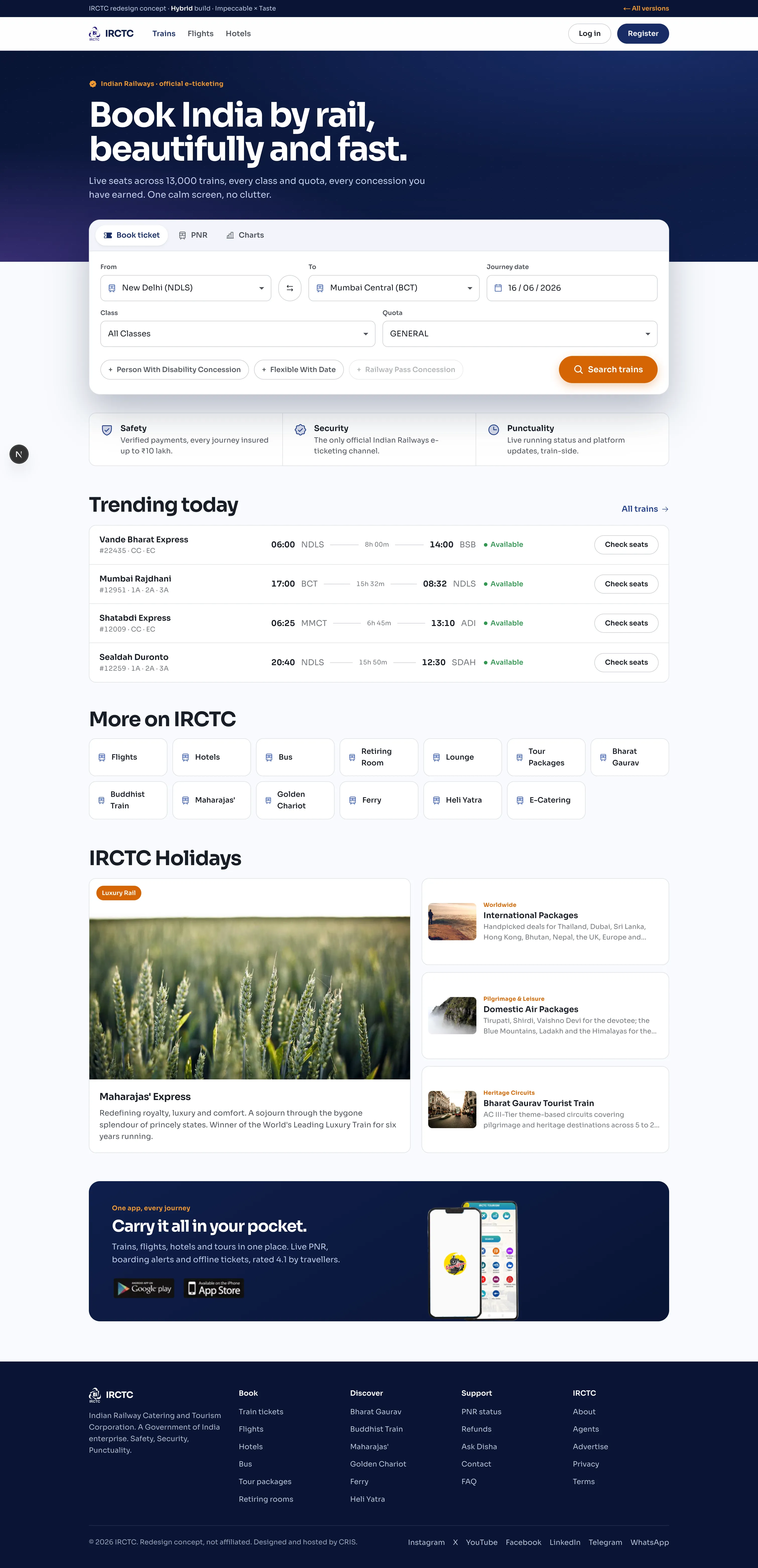
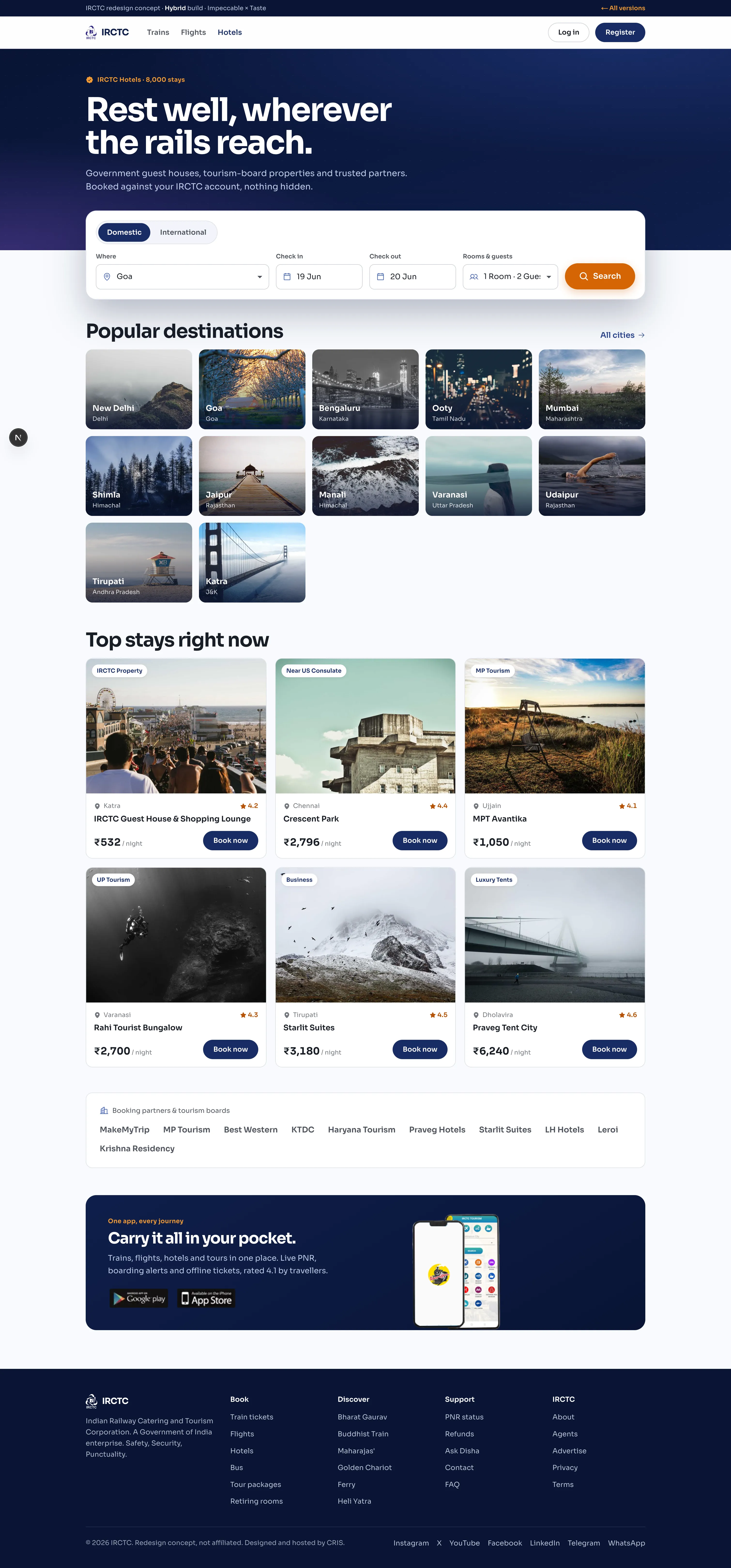
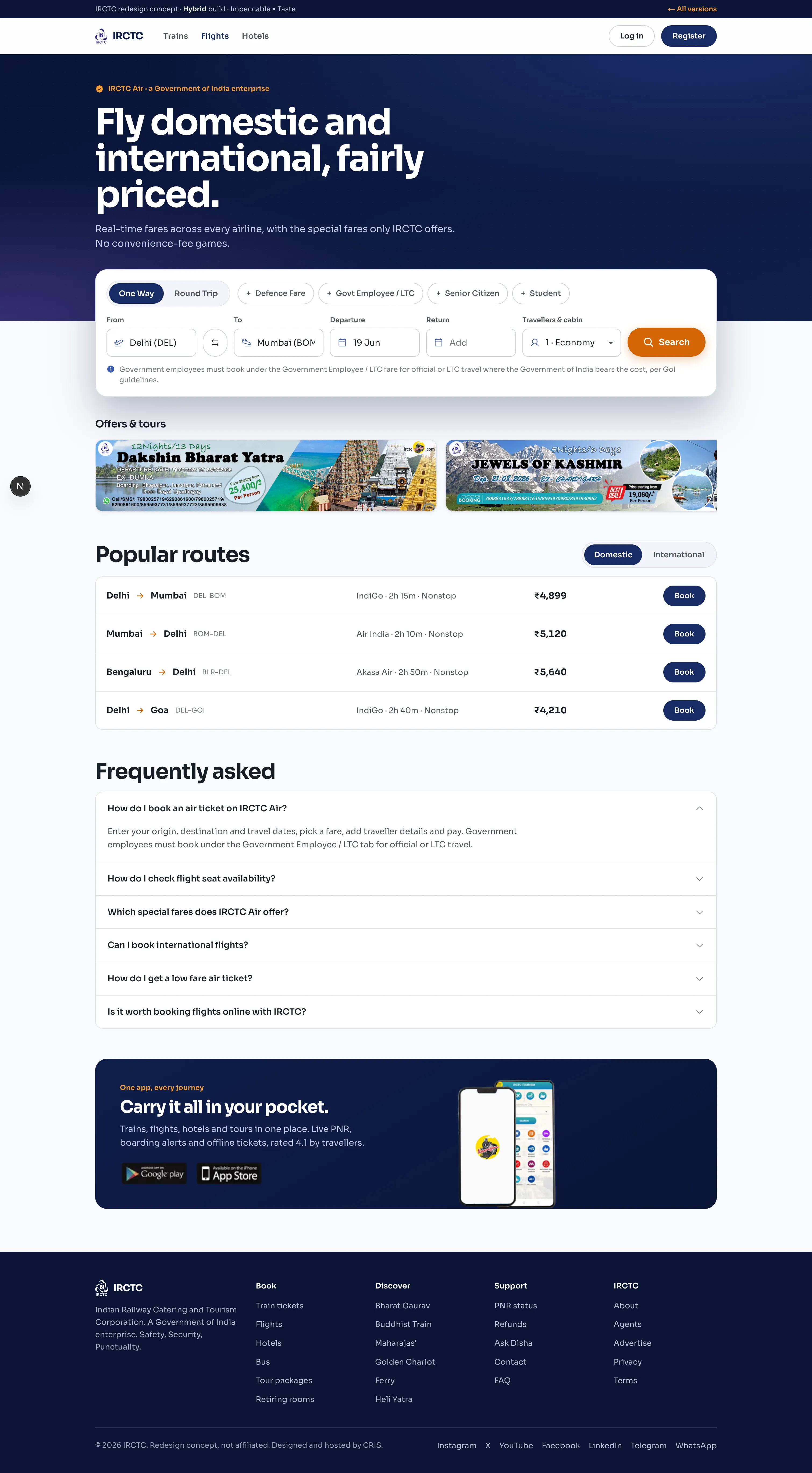
Impeccable × Taste, mergedTypeface · SoraSynthesises both up front. Authentic IRCTC indigo and saffron together; one bold drenched-indigo hero (Taste bravado) over a calm, stateful, tabular product body (Impeccable craft); Sora type; one signature motion. Bold where it is brand, calm where it is task.
Frontend Design, by the book
Anthropic’s official frontend-design skill mines the subject’s world, so IRCTC becomes station boards, departure indicators and signal colours. The most specifically Indian Railways of the calm set, and the freshest type system. Its risk is theme over task: lean too hard on the board motif and the dense forms can start to feel costumed.
Impeccable, by the book
Reads IRCTC as a product, so design serves the task. Committed brand indigo, one saffron accent, Geist with tabular figures, airtight form states. The most trustworthy and usable of the three, the one you would actually ship for a public service. Its only risk is feeling expected: it rarely surprises, but it never gets in your way.
Taste, by the book
Editorial off-white and ink, Bricolage display, a route marquee and one dark color-block band, with its anti-slop bans keeping everything clean. Real personality. But Taste flags product UI as out of scope, and it shows: the bravado sings on the brand surfaces and slightly fights the dense booking forms.
Hybrid, by the book
Zones the page on the real IRCTC palette: bold where it is brand (one drenched-indigo hero, expressive Sora) and calm where it is task (tabular, stateful, restrained). It resolves the tension between the two skills and keeps both trust and personality. The best fit for what IRCTC actually is.